Recent Projects
PlusPAY for Club CITGO
UI/UX Design & Front-End Development
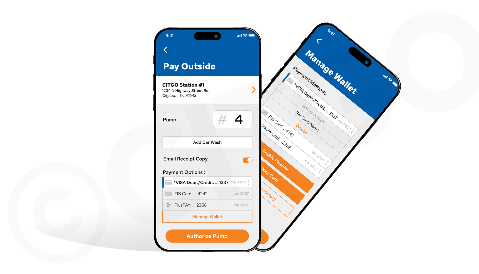
For this project, CITGO was looking to add full mobile pay support to their current loyalty rewards app through PDI Technologies that allowed for debit & credit cards, ACH bank payments, as well as in-house loyalty cards. I was privileged with the task of designing both the new feature's UI & UX, as well as implement and develop the front-end of my designs into the app using PDI's front-end framework, CCMD.
The Problem:
PDI already had legacy ACH and loyalty card support, but they were unrelated and used two separate user-flows, and we didn't have debit/credit support yet, so we needed all 3 to be unified, looking more modern and cohesive.
The Solution:
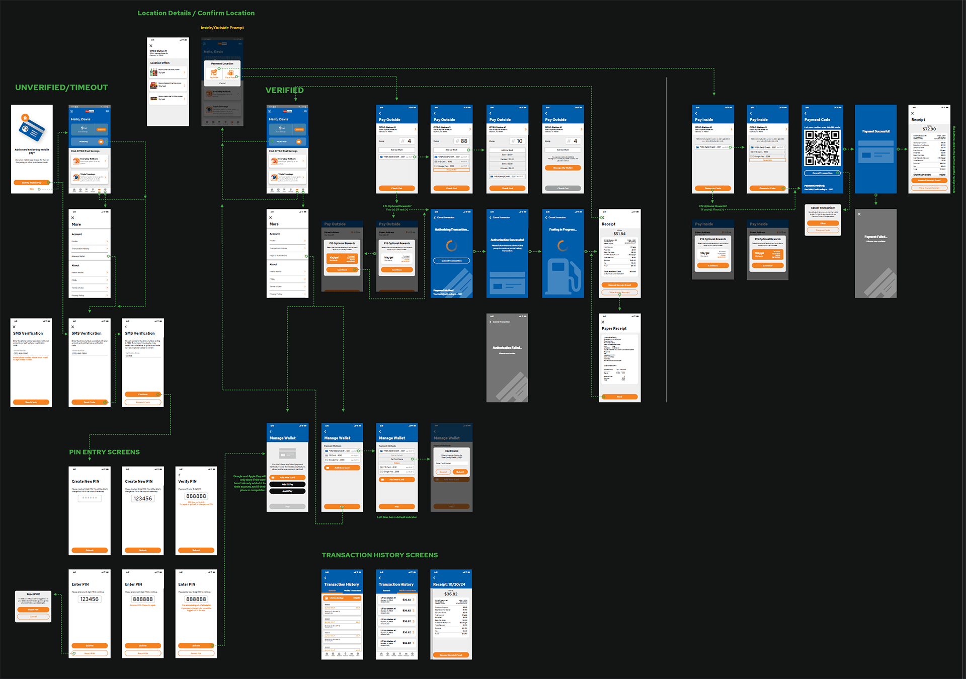
While the engineers did their back-end magic, I took the existing, legacy user-flows for ACH and loyalty cards, along with P97's API demo examples, and drew out a rough user-flow walkthrough on a very hard to understand page in my sketchbook until I had it all in my head. Working with the project development manager, I came up with a basic user-flow map consisting of every screen needed, before branding it and presenting it to CITGO. After a couple further iterations, the user-map shown here was the result.
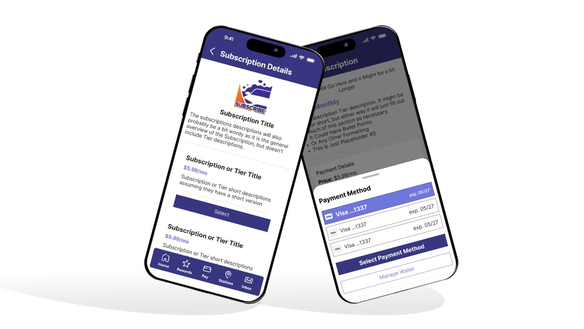
Once we all had a map to follow and a deck of mocks and technical specs to refer to (not shown here for obvious reasons), I worked alongside the back-end developers to build a set of UI templates and screens for them to hook into the newly combined API structure they forged using the aforementioned magic that engineers use to make my designs and front-end actually work. During that process, my most notable achievement is developing the front-end logic and structure of the payment method dropdowns used throughout the payment flow which would go on to be implemented in the future Subscriptions Feature.
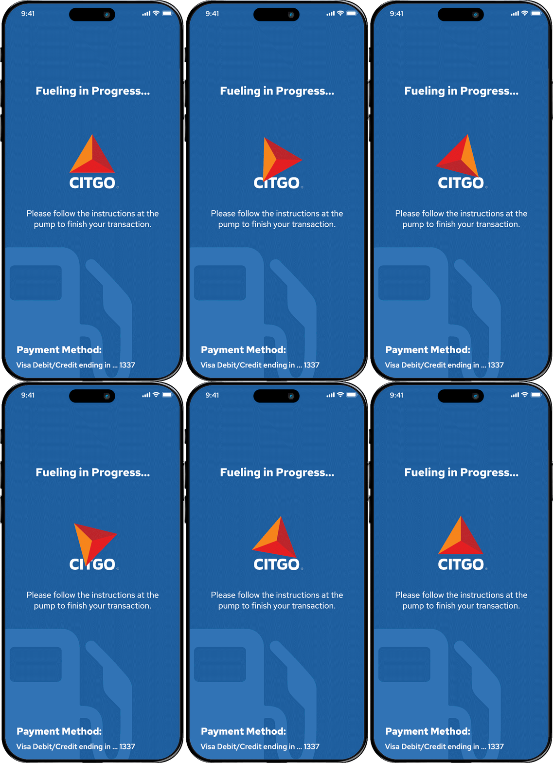
Another personal victory that I'm proud of in this project, while not as technically impressive as the dropdowns, is being able to add my personal whimsy to the payment authorization and fueling in progress screens. During development, we got feedback saying that they were too plain and asked that there is more branding shown on them, suggesting that we add the CITGO logo to each one. Not wanting to clutter the design with a static logo somewhere on the screen, I went out on a limb and replaced the basic loading circle GIF with the spinning CITGO logo symbol GIF shown here. I thought they would think it was misusing their brand, but they wound up loving it!
PDI Loyalty App Subscriptions
UX Design & Implementation
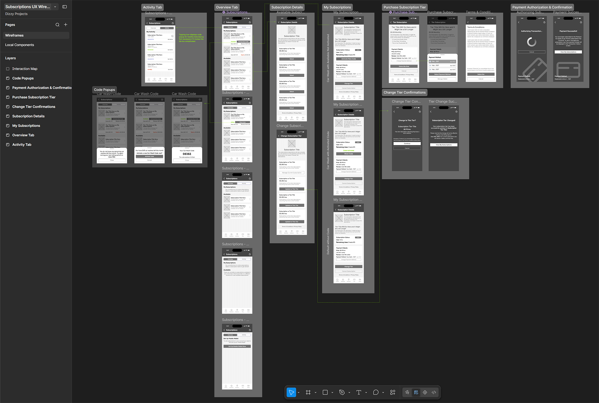
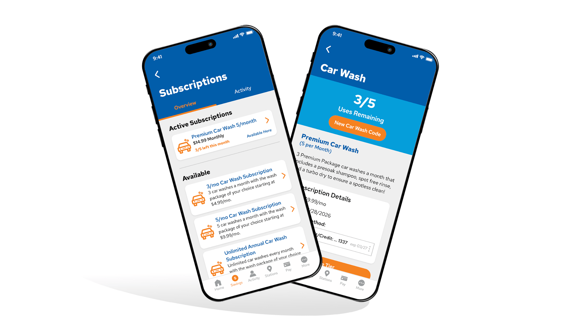
My most recent project focused on the user experience and front-end implementation for the newest mobile app feature for PDI Technologies, the Car Wash/general Convenience Retail Subscriptions feature. It started out as a specific request for car wash support that grew into a full subscriptions service we began adding as a general product feature. Having previously been the sole designer and front-end for our newer Mobile Pay Flow feature, I was charged with designing and implementing the non-branded UX and implementation for this feature as well, as it ties directly into mobile payments.
The Constraint:
This project came with a very tight deadline as it had to be completed in time to have a fully working, in-app prototype ready to show alongside our new whitelabel app's UI/UX overhaul and feature reveal in three months... which I was also working on.
The Only Answer:
Sometimes the best tool or practice comes down to sacrifice and an impending deadline that has no elegant case study to derive after the fact. The only way to finish the project in time was to step away from the auxiliary design I wanted to have ready by the new whitelabel presentation and work with the engineers/project manager to design the necessary UX wireframes that they needed to complete their tasks while at the same time implementing the previously established UI/branding on the screens that the engineers were finished working on. It's never ideal to design a project at the same time as you're building it. It took a lot of calls, and a lot of solving issues as they popped up, but once I was finished with everything that required my attention, I was really proud of how well the feature came together.
The biggest takeaway I found during that process is that while planning and iteration is important in any user experience be it an ad-hoc request or a significant feature, relying on what you know and being able to rely on your team, both the ones picking up the work you had to sacrifice and the ones beside you in the trenches, can still produce great results. This isn't in my portfolio because it's the best thing I've ever designed; I include it because it's a good design that reminded me that while we have processes for a reason, when those processes don't fit within the constraints given to you, the tools, talent, and teamwork you have will often surprise you.
Robot in the Woods (WIP)
Game/Character Design & Development
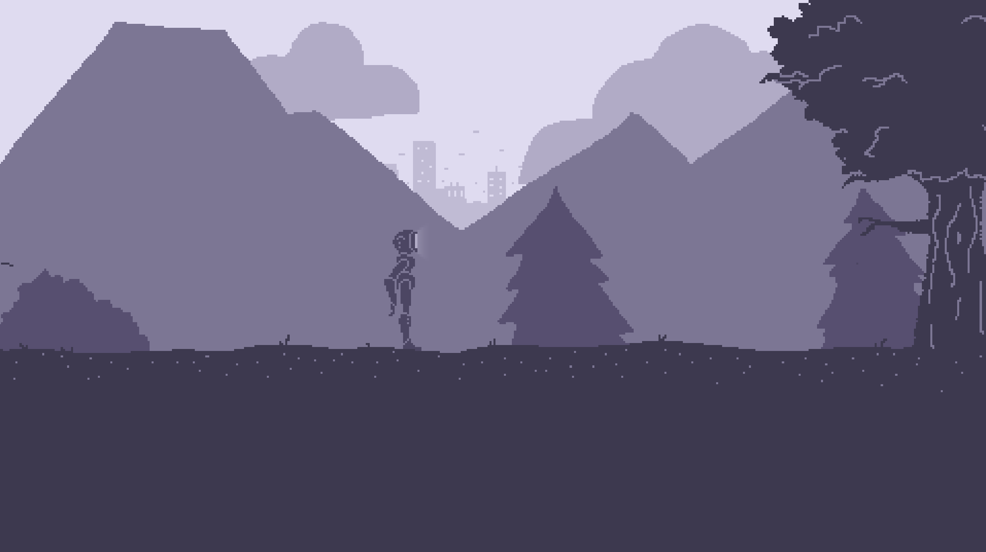
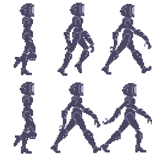
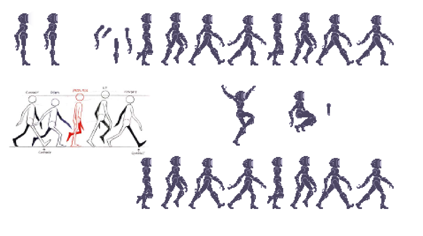
Robot in the Woods is an in development art game designed and built by myself in Godot 4. The original concept art shown here was made in Clip Studio, but the character puppet and test animation was made in Photoshop. This is a personal art project I currently working on about, as the name suggests, a robot in the woods. It's a slow paced, narrative, art game where you play as a robot searching the woods for their owner, overcoming obstacles and puzzles as the narrative is slowly revealed around the player.
The Idea
The inspiration for Robot in the Woods hit me while sketching out characters and GUI designs as both practice and looking for something that stuck. I've always been a fan of lanky, humanoid robots with monitors or other simple-shaped objects as heads, and I've always enjoyed atmospheric games and media that hint at a larger world without ever explicitly telling you. Why are they searching in the woods? What's up with the city far in the background? Keep going and maybe you'll find out. Ultimately the game is about self discovery and understanding, but it's also just fun pretending to be a robot lost in the woods.
The Design
Apart from being a Cool Robot Nerd™, I'm a really big fan of pixel art. One of the objectives of this game is to find ways to make seemingly simple, low-res pixel art look beautiful or awe inspiring. Foreground objects are mostly silhouetted while the background consists of multiple layers of depth. The obstacles or any tasks at hand are plain, to the point, and immediate, whereas the world in which you're in is vast and beckoning, and sometime ominous, but always just out of reach. It's supposed to evoke the feeling of loneliness in a large, lively land; like being a stranger in your own home.
Why is this on my UI/UX & Front-End Dev portfolio? The dev part is obvious, but a key idea in this project is communicating the story and objectives and game mechanics without any exposition or tooltips or interface at all outside of the necessary "New Game" start menu. This is as much of an exercise in UX as it is in development. How do you convey "this is an object you can interact with" without "press x to interact" or just forcing the player to guess blindly? That's the experiment. This is a work in progress so I'm still figuring a lot of that out myself, but that's my job as a UX designer, and that's why this belongs here. Once this case study is complete, it will probably deserve it's own page.
The Development
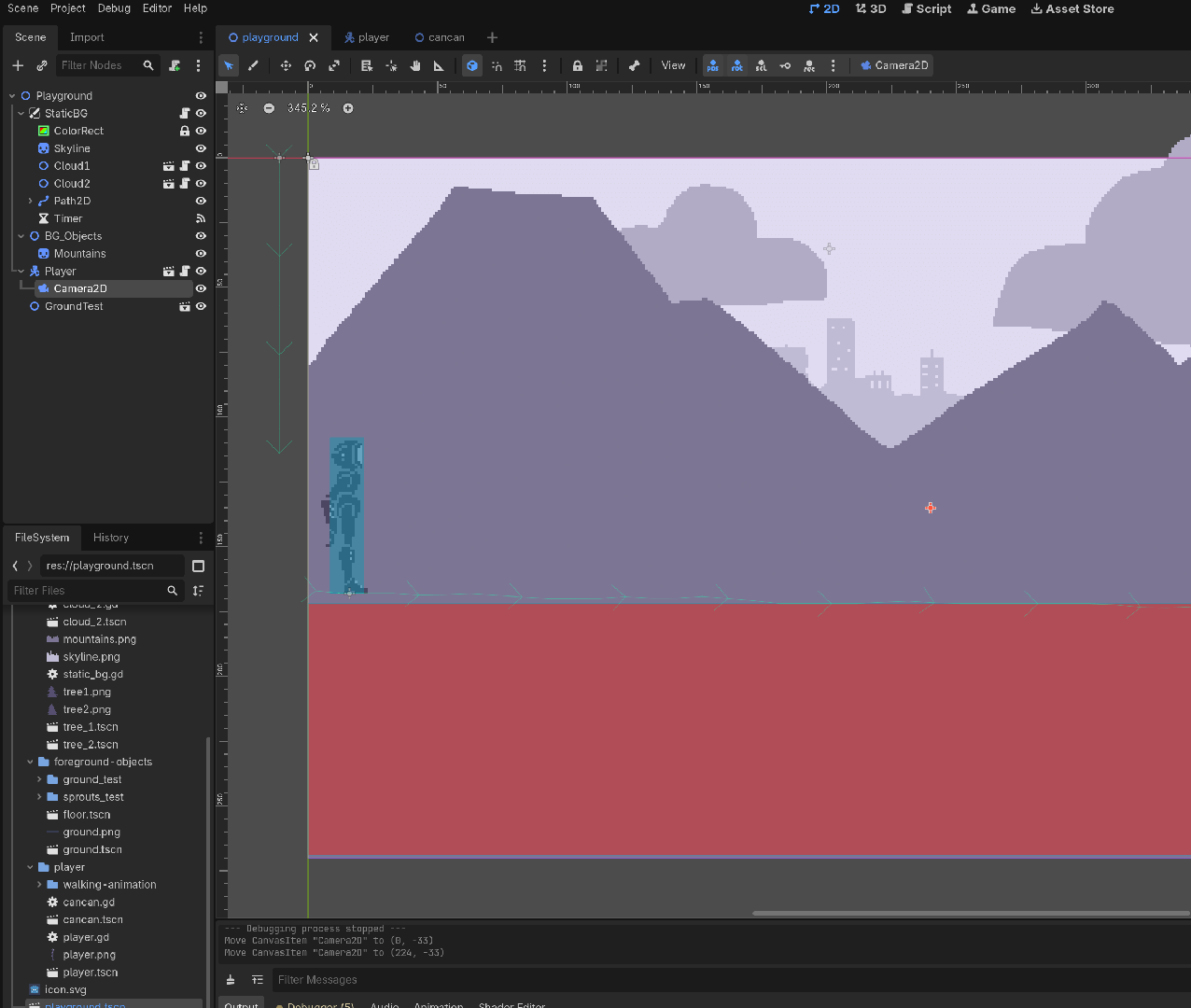
While I'm talking about things I obsess over, procedural generation is probably in the top three. I want this game to be a narrative art game while also having replayability and a sense of surprise. To do this, I created two systems in Godot: one that procedurally generates the ground the player walks on, both in shape and also foliage; and one that randomly generates the clouds and background trees, shrubs, rocks, etc. By creating the ground in random, small to medium size "chunks" one after the other, I'm also able to map a path array that sticks to roughly the top center of each chunk, creating both a spawn path for plants and objects, and a surface to walk on. This path can vary from directly on top of the chunk to just below it, adding an extra level of depth to the environment. Not all ground is even.
I look forward to sharing more about this project as it grows, and I hope you'll get to play the finished version sometime sooner than later!